


You hear about jewelry branding all the time when you start marketing your small business, but what exactly is it and why is it so important? Learn more about this important jewelry marketing strategy.
Like many other marketing strategies, “branding” doesn’t have a clear one-size-fits-all definition. The first thing most people think of when it comes to branding is your logo. And while your logo is the foundation of your branding, there is so much more to successfully branding your jewelry business...
Skip ahead to blog sections:
Creating Your Unique Jewelry Brand
What is Branding?
Branding has a few definitions:
From the dictionary, branding is “the promotion of a particular product or company by means of advertising and distinctive design” or “distinctive wording or design used to identify a particular brand”.
From Entrepreneur Encyclopedia, “Simply put, your brand is your promise to your customer. It tells them what they can expect from your products and services, and it differentiates your offering from that of your competitors. Your brand is derived from who you are, who you want to be and who people perceive you to be.”
In practice, your branding should include:
Your Business’ Mission
What is your jewelry brand’s mission? Tell your potential customers what your business and brand are all about. Summing this up in your mission statement will let your customers know what kind of business they are supporting. Think about your brand’s values as well. Many potential customers will buy from a brand if their values align.
Your Jewelry Brand’s Visual Identity
Your visual identity includes your logo, any graphics you create, as well as the colors and overall look of your brand. This may include using certain font styles, whether that’s clean lines or swirly script fonts. You should also decide if your brand will give off a vibe of modern, elegant, vintage, etc. This should be everywhere. Your website, social media, emails – anything that you can customize the look of should fit the overall visual scheme of your brand.
Your Brand’s Messaging
What are you going to tell your customers? What do you want your customers to know about your brand? Maybe you want to let them know about your eco-friendly business practices, your studio pets, or your behind-the-scenes process. When you post a photo/video or write an email, think about the things your customer would most like to know about you. Consider writing a tagline that embodies your business and brand in one sentence or phrase.
Your Brand’s Voice
Once you’ve decided what to tell your customers, decide how you should convey the message. This is the time to decide on your brand’s personality. Do you prefer to maintain an air of high-end elegance or do you have a bit of a quirky and fun personality? Again, this should come across through all of your channels and any employees should be given guidelines for how to interact with customers.
Why is Branding your Jewelry Business Important?
Branding is a lot of work. But it’s worth it! Think of a brand you know and love. Why do you prefer that brand over another? Many successful branding campaigns make us believe their product is better than a very similar item - sometimes it’s true, sometimes the off-brand version is just as good. Either way, we begin to form a brand loyalty because we believe every product is going to give us the same happy feeling when we buy it.
Your branding is your chance to connect with your customers and share your mission statement. Every time a customer interacts with your brand, they should feel like they are speaking with you. Use this time to explain who you are as a person and a business. The more they get to know you, the more likely they are to come back for more jewelry.
Most importantly, branding distinguishes your jewelry from every other jewelry business on the market. It should show your customers why they should pick your jewelry over another brand. When someone thinks of quality handmade jewelry, you want them to think of you! Having a consistent and quality branding strategy will help portray your business as a highly trustable jewelry brand. It will also make your brand more recognizable so a customer can share your business with their friends and family.
As your business grows you may find that your brand is evolving - and that's fine! Many companies go through periods of re-branding. But the core of your brand should remain consistent for long-term recognition.
How to Start Branding Your Jewelry Business
Before you start designing the look of your branding essentials, it’s time to think about what defines your brand:
- How is it currently perceived and how do you want it perceived: When someone looks at your business, whether that’s on a website, social media, or at a fair, what is the first thing you’d like them to think about your brand? For example: eco-conscious, affordable quality, healing crystals, modern minimalist, vintage, high-end. Ask people how they currently perceive your jewelry and branding. Do they match?
- What makes your product stand out: With the rise of Etsy, handmade jewelry has become a common product. What makes your brand stand out? And if you’re not the cheapest option available, why should someone choose to purchase your jewelry instead of the cheaper product? Maybe you use more recycled material or have better customer service. When you package someone’s order, do you dress it up with ribbon and include a personalized note? Even having an easier check out process than other business may help your product stand out. If you use a higher quality product that’s an easy point to make – though you may have to explain to customers the difference between the products (i.e. gold-plated vs. gold-filled).
Jewelry Branding Foundations
Your logo and color scheme are going to be the most visible part of your branding, so you want to make sure these are consistent across all channels. It’s okay to have a main logo and an alternate option, but you don’t want to create too many. Again with the color scheme, it’s okay to occasionally use other colors than your selected palette. What you want to avoid is using too many colors too often. Try to stick with a general palette. For example, at Halstead you’ll see a lot of deep red (we call it Halstead Red) mixed with white, black, and gray. But we do mix in other colors depending on the situation and theme.
Expand your Visual Identity
Beyond your logo and color scheme, there is a lot more to think of when you’re creating a visual identity for your brand.
- When you take photos, what will the backgrounds include? This could remain consistent or you may choose to make seasonal backgrounds.
- When you post photos on social media, do you want to use a particular filter? Some brands also like to create a pattern in their Instagram grid.
- What are your show displays going to look like? Think about the tables you want and the display holders as well as the signage you’d like to show off. If you have a physical store, you may want to make your temporary displays an extension of your store branding.
- How will your packaging fit into your branding? You can keep it simple with a branded necklace card or you can take it up a notch by adding jewelry boxes, colored paper shreds, etc.
- What marketing collateral will you need and how will you incorporate your brand? This might include business cards, information cards (i.e. product care), small brochures that tell your story, etc.
Always remember the key to effectively creating a visual identity is consistency across all of your marketing channels.
Establish a Brand Voice
Your jewelry business branding should be a reflection of who you are as a person. Think about your personality traits and incorporate them into your business. Your branding should quickly and easily convey your brand’s personality/voice. The easiest way to convey your voice is in your copy. Think about the words you want to say and how you want to embellish them – do you want to get straight to the point in a social media post or tell a story in every post? You may also want to include your jewelry story as a way to connect with your customers.
You won’t always be a one-person shop, so make sure you establish some guidelines for employees about the personality of your brand. Of course we always want friendly customer service, but think about smaller details as well. If one person loves to use emojis on social media and the other doesn’t, you may want to establish guidelines for using them (yes/no, how often, etc.).
Establishing your jewelry business branding isn’t always going to be an easy task, but when it’s done well it will certainly pay off in the end. Distinguish yourself and your jewelry from the other options on the market and connect with your customers to ensure long-term relationships.
Designing Your Brand Logo
When thinking about your brand visuals, some business owners choose work with a professional graphic designer to create a logo and other graphics. If you're able to do this, fantastic! If not, it's not as hard to create your own logo and graphics as you might think. Read on for a walk through and best practices from graphic designer Janelle.
Pre-Design Process
Before you can jump into making your logo and brand, you’ll need to understand what exactly your brand is. Sometimes the brand you currently have envisioned for yourself may not line up with the audience you wish to target.
Business Identity
As we stated before, you’ll want to make sure your brand is in tune with your business and jewelry products. Much like creating a business plan you’ll want to break down what your business is and who you are trying to market to.
There are some key questions you’ll want to answer:
- What is your business mission statement/elevator pitch? Aka what is your business and what does it offer. Don’t answer with a ‘I am a jeweler and I want to sell jewelry.’ Really think about your business and what you are selling. TIN HAUS's statement is a great example: TIN HAUS is a minority woman-owned contemporary fine jewelry brand based in Los Angeles. With an emphasis on uncompromising quality, research, and sustainability, we create bold-minimalistic statement pieces for men and women that are made to love and last forever.
- What is the meaning or story behind your business name? This question will hold less relevance if your jewelry business is named after you, but it may still help to answer anyway.
- Is there something unique about your business name or jewelry? Maybe you source your supplies locally or work solely with opals. What ways could you convey those things in your branding?
- Who is your target audience? And just like with a business plan do not say ‘working women between the ages of 20-50. That will get you nowhere. Really carve out who you want your audience to be. Knowing who you want to target will help you develop a strategy on HOW to target them with your branding.
- What values do you want your branding to convey? Is your jewelry high end or more for everyday wear? Adventurous or down-to-earth?
- How do you want people to feel when they see your brand/logo? Do you want your customers to be excited? Or maybe at ease? Will they have the same feelings when they see your jewelry?
Now remember your branding doesn’t have to convey the answers to each of these questions. These are meant to guide you to figure out what exactly you want your brand to say.
Branding Visuals
Now that you know what you want your brand to say, you need to figure out how to say it. Think of a business brand that wants a funky fun identity, what colors would you use to convey that feeling? What about for a jeweler that wanted to be more luxurious for men? What colors would you use there?
Think about these next few questions. At this point your choices don’t have to be set in stone, these will help you set the groundwork.
- What colors would you want to represent your brand? What colors would you NOT want?
- What attributes and/or emotions do you want people to feel when they see your brand? What would you NOT want?
- What words would you use to describe your brand? What words would you NOT want to use?
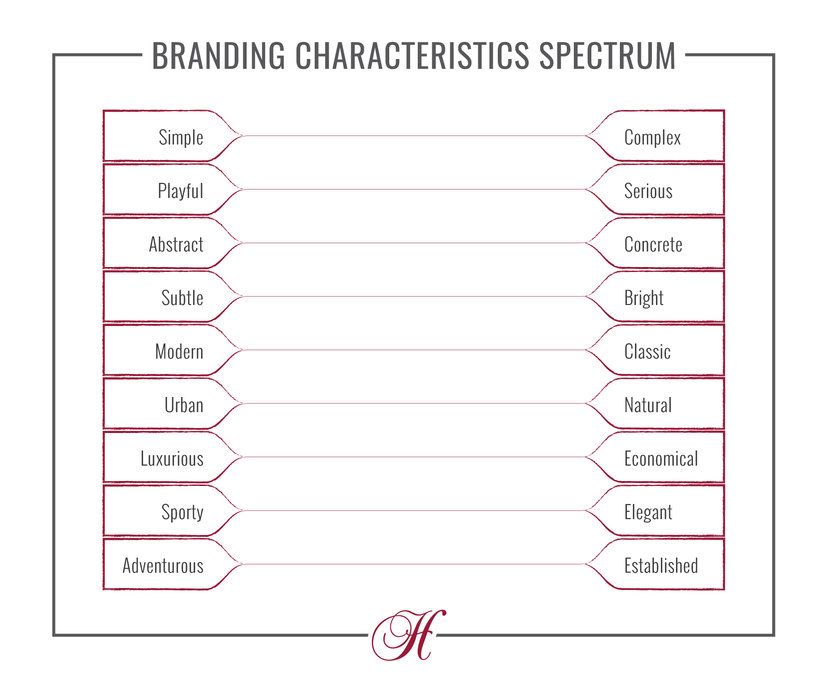
If you still need some more help with determining your branding visuals, use the chart below to get a better idea of what characteristics you want your brand to show. Feel free to print it!
Putting it All Together
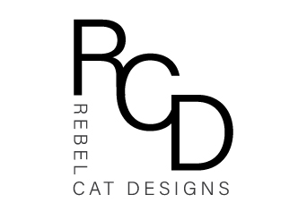
Now let’s say I’m opening a (fictional) business called Rebel Cat Designs. As we go through the next few sections you can follow along as I build a logo and brand for this company. You’ll be able to see how branding can come to life, as well as what works and what doesn’t. Before we go forward, we’ll want to establish what exactly is the company Rebel Cat Designs. So let’s answer the questions above:
Identity
- What is your business mission statement?
I want to create high end style jewelry with a fun twist - What is the meaning or story behind your business name?
I have a very smart and rebellious cat and the name works well for the target audience - Is there something unique about your business name or jewelry?
Since it is based off of one of my cats - Neytiri - the logo could be styled off of her - Who is your target audience?
Young working women who want sophisticated looking jewelry with a unique twist but would balk at spending $100 on a single piece. - What values do you want your branding to convey?
Sophisticated but fun - How do you want people to feel when they see your brand/logo?
Welcoming and fun jewelry store
Visuals
- What colors would you want to represent your brand? Black, White, one pop of color
What colors would you NOT want? Pink, Yellow, Green, Brown - What attributes and/or emotions do you want people to feel when they see your brand? High end, fun, affordable
What would you NOT want? Snobby, exclusive, expensive - What words would you use to describe your brand? Modern and fun
What words would you NOT want to use? Vintage, drab, uniform
We also completed the branding characteristic chart for Rebel Cat Designs:

1 - Fonts
Licensing
You can’t just choose any font you find on the internet for your logo and branding. Not all fonts are free, and when they are it doesn’t mean you can use them however you want. Whatever font you choose, make sure it’s available for Commercial Use. Fonts that say they are for Personal Use cannot be used for commercial applications unless you buy them.
Readability
Fancy or script fonts are perfectly fine, fancy or script fonts that are difficult to read are less so. If you are worried about a font you’ve chosen, change a random sentence of copy to the font in question. If you have difficulties reading it, chances are your customers will too. And you can’t just test it out on your business name, you already know what it says so you’ll have no difficulties reading it. Make sure the copy is something you don’t know so you can look at it with fresh eyes.
Now I’m not saying you should completely avoid fancy fonts altogether. Fancier fonts on 1 or 2 words are easier to read than entire sentences or paragraphs, so if you know you won’t use the font in long sentences, go ahead and go for your fancy font!
Style
This is where the questionnaire from earlier comes into play. You’ll want your font to match your branding scheme, so no choosing a comic-style font for a high end boutique.
Serif - These fonts tend to have a more traditional feel. Easy to read.
Sans-Serif - These fonts are more modern. Easy to read.
Script - These fonts can convey both high end or fun depending on the font. Can be hard to read.
Fancy/Display - Much like script fonts, these fonts can have a wide range but can also be hard to read
Don’t be afraid to mix & match. If you really like a script option but it’s hard to read with long sentences, do all or part of your business name in the script font and pair the rest with a Sans-serif font. There’s lots of resources online for great font pairings, see if there’s one that has options for the font you like!
2 - Scalability
When creating your logo, you need to think about the largest (think store sign or billboard) and, more importantly, the smallest (think logo tags or other marketing material) you’ll ever show your logo. Simply scaling your logo down won’t work - at a certain point it may be too complex or the lines too thin to be seen properly at such a small scale. Most businesses have two versions of their logo, the one you regularly see and one meant for smaller scenarios.
When designing for smaller scales, you’ll want your logo to be less complex and have thicker lines. Take our Jewelry Business Forum logo for example, the large one has a fairly complex diamond while the one made for smaller scales has a simpler version:
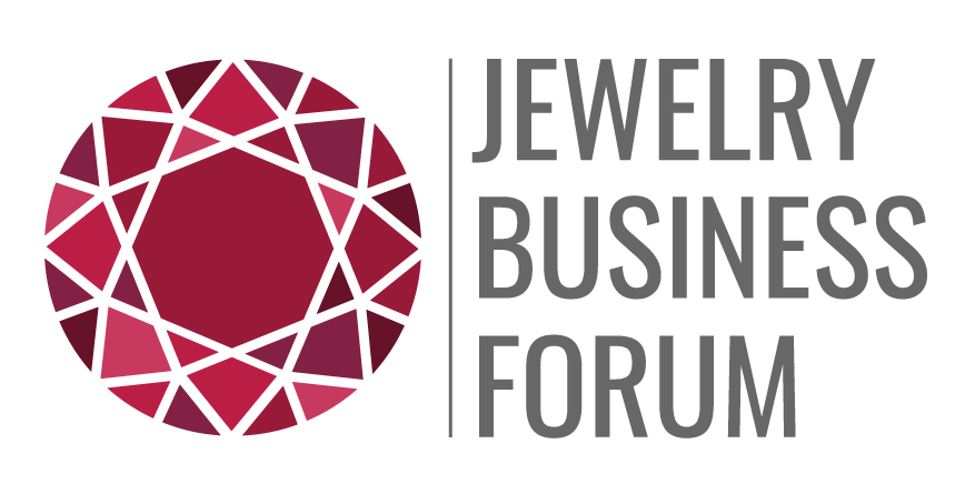
Now let's compare how just scaling down the regular version looks next to the made for small scale version:
As you can see, the large one scaled down is just too complex at such a small scale and the divider line all but disappears.
3 - Color
Color is extremely important when it comes to logos for it is one of the easiest ways to show off the personality of the brand.
While ultimately the color is up to you and how you feel it represents your brand, you should keep in mind the psychological effects of colors, aka the emotions people feel when they see different colors. Think red vs blue, red is generally seen as a powerful and high energy color, whereas blue tends to feel more calm and relaxing. Want to learn more color psychology for logos? 99designs has a great blog with resources that you can check out.
Beyond brand recognition, color is also one of the best ways to make your brand cohesive. That means you will want to make sure to not only think about but plan out your colors, especially if you plan on having more than one (other than black & white.) A great website to plan out colors is Adobe Color which allows you to generate color palettes. They’ve also added great accessibility features, including a contrast checker so you can check to make sure your colors have enough contrast with each other.
Now when it comes to designing your logo, color should be the last thing added. You want to make sure your logo works in black and white/grayscale before you go on adding crazy colors since you won’t always be able to print in color.
Logo
The first thing you’ll want to design is your logo. Once you have your logo your other branding and marketing designs will follow since they’ll be based off your logo. I'll design several logo styles for Rebel Cat Designs so you can understand the differences as well as the pros and cons to each type.
Types of Logos
Logotype/Wordmarks
One of the simplest ways to make a logo is by simply using your company name. But because you are only using your company name, it can be a bit tricky to make sure your logo will stand out.
Unless you have jewelry as a part of your name, it will be harder for potential customers to know what you sell based solely on your logo. This can be avoided by including a tagline. With Rebel Cat Designs, we could include the tagline “modern jewelry for rebellious women” to solve the issue.
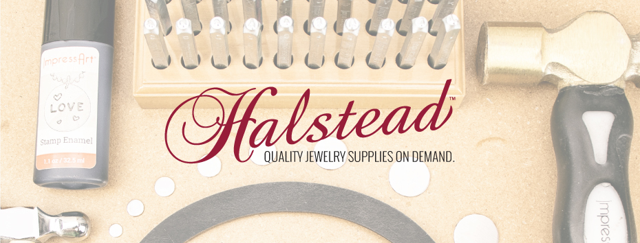
When looking at real world examples, Halstead’s logo is a great example of a Logotype. By including two types of fonts (script and sans serif) as well as angling the business name to give room for the tagline, the Halstead logo has much more visual interest than it would have otherwise.
There are a few factors you’ll need to think about when it comes to creating a logotype:
- Font
- Case (Title Case, UPPER, lower, or a combination with two of the three)
- Weight (Regular, Bold, etc.)
- Color
Now let’s look at some examples for Rebel Cat Designs.
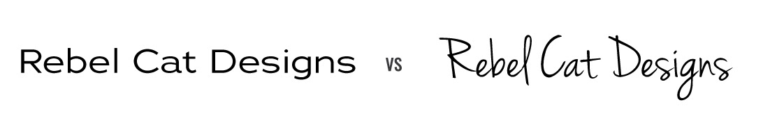
See how much difference a font can make when it comes to the feel of the brand? What type of product would you expect to see if you went into a shop with the first logo vs the second?
Also did you notice how I said product over jewelry? Would you have expected jewelry to be the product or would you have thought they were design businesses?
Now let’s add in the tagline and see how that makes a difference.
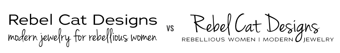
While I did change up the tagline for the second example (which again goes with the ‘expect to change things as you make the design’ tip), you can see how adding in the tagline made a big difference. Before the logo looked more like run-of-the-mill fancy text. Now by adding in the tagline both feel like actual logos.
Look at the fonts, did you notice anything in particular? The same fonts were used in both designs, once for the business name and once for the tagline. The reason I did this is to show how the same font can have a completely different feel depending on its use.
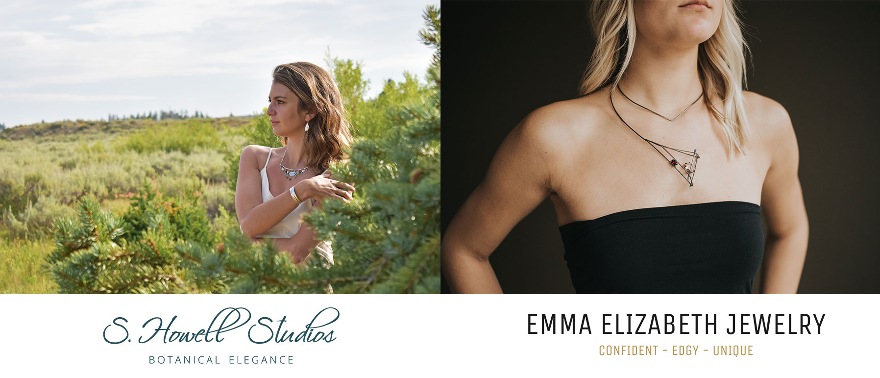
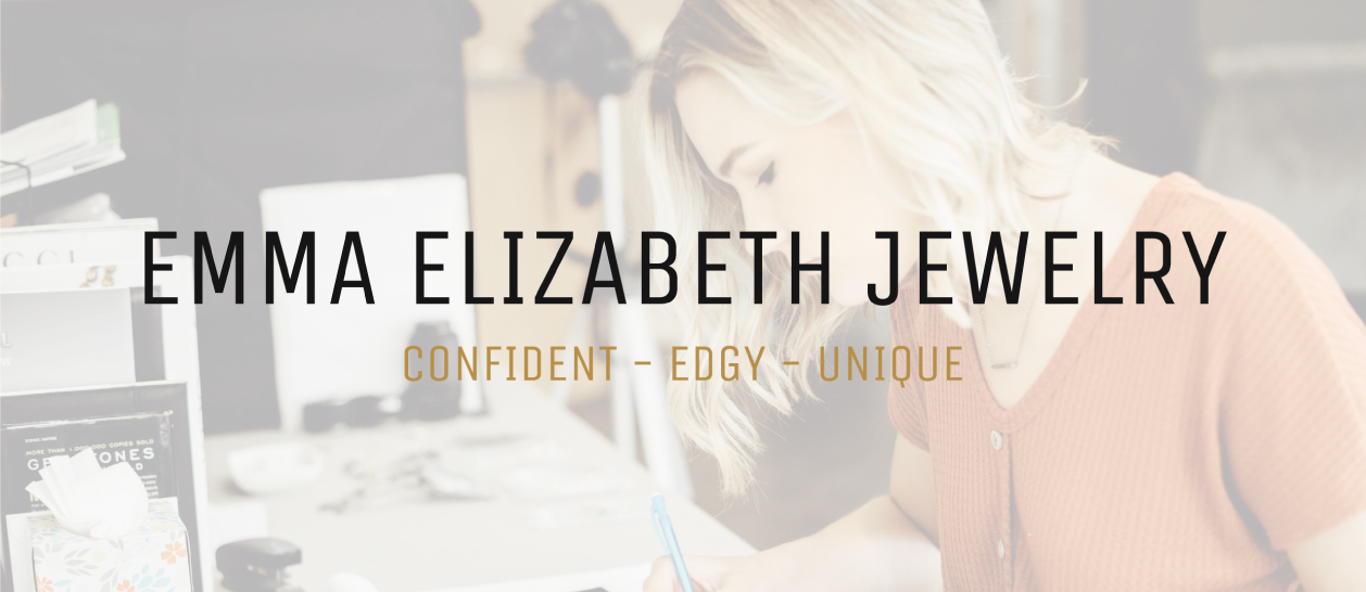
What other ways can you use a tagline? Take a look at Emma Elizabeth Jewelry's logo:

Remember question #6 from figuring out your branding identity: How do you want people to feel when they see your brand/logo? Her tagline is her answer to that question, though I'm sure it originally was to describe her jewelry line. No matter what it works perfectly for both branding and jewelry design purposes, people can already imagine what jewelry they'll see after looking at her logo.
Now let's get back to designing our Rebel Cat Designs logo by adding in some color. This time we’ll just use the second logo for comparison since the first worked better in shades of gray.
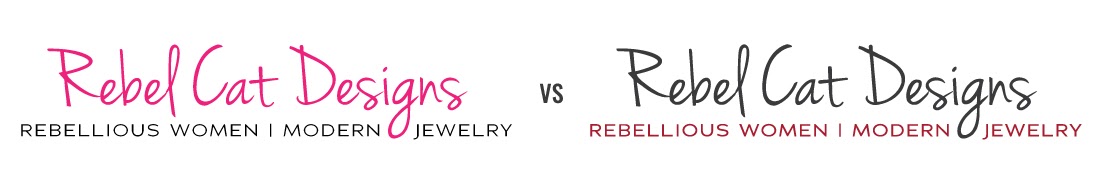
See how even the colors can affect your view of what jewelry you think each business may sell? Remember to go with what works best for your business’s personality, you want people to know what they are getting when they see your logo.
Lettermark/Monogram Logos
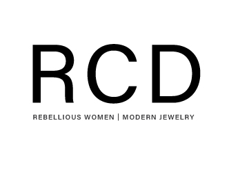
Lets say your business name is really long, or maybe you want to be able to use it in really small scales, then you may want to look at lettermark logos. These are similar to logotypes but instead of spelling out your business name you just use the first letters, so Rebel Cat Designs would become RCD. CNN, Wordpress, McDonalds, and HBO are some well known brands that use lettermark style logos.
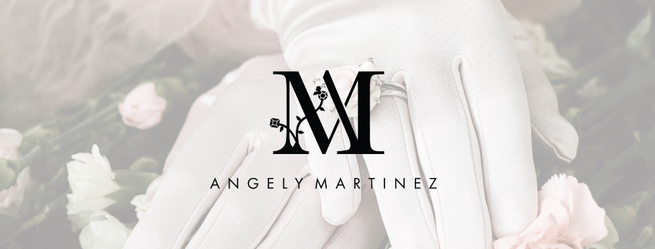
Lettermark designs do not have to be just plain fonts. As you can see by Angely Martinez’s logo above, not only do the A and the M overlap in a beautiful way, but the added touch of the flowery vine creates a unique feel and helps the logo stand out in a crowd.
The same factors that applied to the logotype section apply to here as well with one addition:
- Font
- Case (Title Case, UPPER, lower, or a combination with two of the three)
- Weight (Regular, Bold, etc.)
- Color
- Layout
Layout is important here since many lettermark logos would otherwise be extremely simple. Offsetting or overlapping the letters or making a circle with the tagline or full business name can help make a lettermark go from plain to pop!
As you can see the second logo is much more dynamic than the first, but depending on what feel you need for your branding, the second option may not work.

Symbol/Icon Logos
This type is probably what most often comes to mind when you think of logos. Whereas the types of logos we’ve talked about before are textual, symbol logos are visual. The best brands that illustrate this type of logo are Twitter, Apple, Nike, and the Olympics. Whereas these brands can all be recognized by just the symbol alone, you will not have this luxury. For most marketing purposes you will want to include your business name so that customers can begin to associate the symbol with your brand. The one shown above is from Christine Bates and is the graphic design equivalent of her signature jewelry style, which is a nice touch. Customers will immediately recognize her icon after buying her jewelry and vice versa. She also has versions of the logo with the business name included for use on places like her website.
Factors you will need to need to think about when designing your symbol logo are:
- What will the symbol be?
- Complexity - Will your symbol scale down well or will you have to design a secondary, less complex logo for smaller applications?
- Color
When it comes to designing your symbol, you will want to start with a good brainstorming session. Don’t just settle with the obvious for a symbol (think a cat for Rebel Cat Designs), though there is nothing wrong with that. The reason why you shouldn’t just settle for a cat is that you may miss some way of making your symbol more unique through brainstorming.
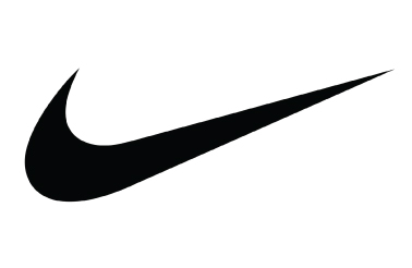
Another thing to keep in mind is your logo doesn’t have to be a literal representation of your brand, it can be more abstract. One great example is the Nike swoosh. While it doesn’t represent a shoe, it does represent swiftness - an abstract thought that Nike sells. They don’t just sell you shoes, they sell you swiftness. Maybe you want your brand to do more than sell people jewelry, maybe you want it to sell people a new image. In that case would a ring be the best icon of choice for you? What other ways could you represent the concept of getting a new image?
Now looking at our Rebel Cat Designs, what are different ways of representing a cat besides a full body symbol? What about rebel?
- For cat, I came up with: Tail, head, paw, ears, eyes, and whiskers
- For rebel I had: Sunglasses, leather jacket, lightning, skulls, and a slash
Now that you have your list, you can look at ways you can mix and match the words to create a unique design. Don’t be afraid to look at inspiration, but do not try to replicate something that you’ve seen. Designs are copyrighted so copying them will put you in legal jeopardy.
My choice of words is eyes, head, and lightning. What quick icons can we come up with from those words?
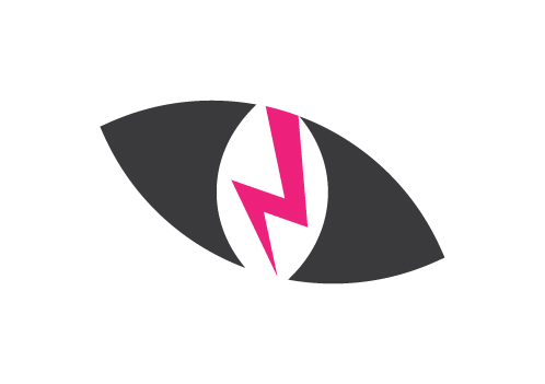
Both give the impression of Rebel Cats right? While the first is more obvious, the second still gets the point across, so it’s up to you and your tastes on which you’d go with. Now remember, these are great designs but unlike Nike, you won’t have brand recognition based on the icon alone so while you can use them solo on certain marketing materials, you’ll need to work in your business name for most things. That leads us to the last logo type:

Combination Logos
Combination logos are exactly what their name implies - a combination of wordmark or lettermark and icon. For small businesses that want to have an icon in their logo, this is probably their best choice since it still includes their business name to help increase name recognition.
When creating a combination logo, the part that should be designed first is the icon. Since the icon is so visually impactful, the wordmark/lettermark should be able to compliment it.
There are three main ways of creating a combination logo for your jewelry business: side-by-side, integrated, and emblem.
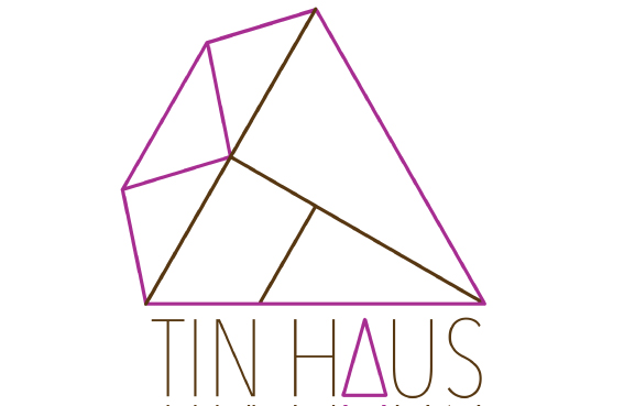
Side-by-Side
This is probably the easiest way for you to combine your icon and wordmark/lettermark. These logos have the icon placed somewhere next to the wordmark, whether it’s above, to the side, below, or in between. Above is an example by TIN HAUS where Christina Grace’s icon is placed above her wordmark, which is what we’ll do with Rebel Cat Designs.
Notice how the wordmark is different from before? This is an example of how not only can your logo change throughout the process of the design, but how the wordmark should be designed to compliment the icon.
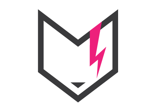
Integrated
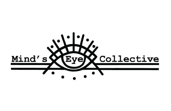
This type of logo is a little more tricky to create, but the results can be stunning. Integrated logos are where the icon is used as part of the wordmark/lettermark. The Mind’s Eye Collective icon (the eye) was designed to be used both as a solo icon and as an integrated wordmark.

Again we have a lettermark change. To use the current icon with the current font would look weird, so I switched to a font that was more angular. As you can also see I clipped out the right side of the cat icon to create a sort of ‘C’ effect.
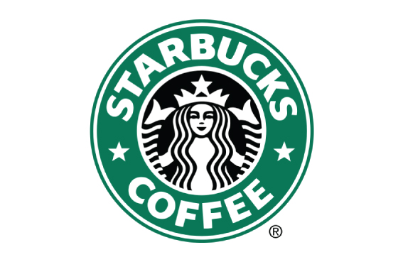
Emblem
Emblem logos are designed to be encased in some sort of shape. A few that are probably some of the most well known would be Starbucks, Harley-Davidson, and VW logos. These have gained in popularity in recent years with businesses wanting to have a more vintage feel for their branding.

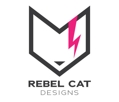
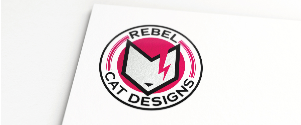
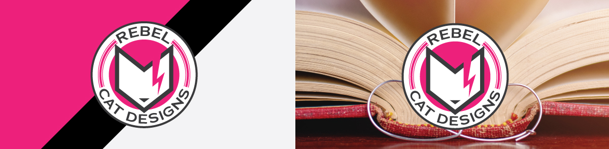
Now you can see how a single icon can be used in many ways to create a logo. Be flexible as you create, just like with jewelry designs. Sometimes inspiration can strike through mistakes, while other times the idea you envision in your head just doesn’t work when it’s put to paper. Now would be a good time to point out my use of pink in the logo, despite the fact that it was one of the colors I said I did NOT want in the logo. During the design process I found that no matter what color I picked, the pink always seemed to look better as part of the design and so I decided to just roll with it.
Final Steps For Your Logo
Once you have decided on a design, you’ll now need to make a few iterations of it.
Scale
First create at least two scales: one large - this should be the one you just created for it will most likely be the most detailed, and one small. For the small logo you’ll need to increase the weight of your text (aka use demi-bold instead of regular), enlarge small parts that can’t be cut, and simplify any complex pieces.
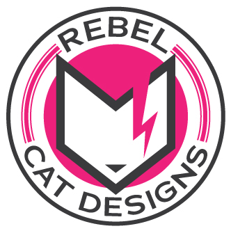
Let’s use the Rebel Cat Designs emblem from before. Below is an unchanged version of the one above. Notice how the thin pink lines blend into the larger middle one and the nose and copy are hard to read?
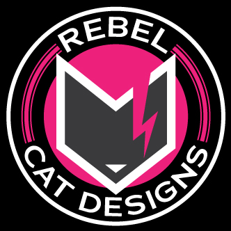
Now here’s an updated version at the same size. The font is now at a heavier weight with more spacing added between the letters (tracking) to make the letters more defined. The smaller pink lines have been removed and the remaining pink line and the outer gray line have been thickened. The final touch was to increase the size of the nose. The first logo is the unedited version while the second is the improved one for smaller scale.


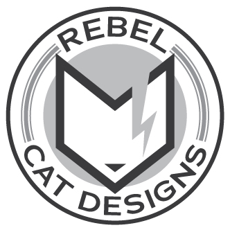
Now if your logo is still too complex at a smaller scale, you may need to cut out some parts entirely. In this case I would remove all copy and use just the cat icon.
Multiple Colors
Your logo will not always be shown on a white background, so you’ll want to design at least three iterations. One will be for light backgrounds, one for dark backgrounds, and the final one for printing in grayscale. Another version you may be interested in would be a full white mark that you can use as a watermark on your photos.
Saving
You’ll want to create your file in a vector program (Illustrator, CorelDRAW, Sketch, etc.) This will allow you to scale your logo as large as you need it without it ever pixelating. Save it as a .png file so that it can be placed on different backgrounds, including your photos as a sort of watermark.
Never delete the working file (again the Illustrator, CorelDRAW, Sketch, etc. file, not the .png version) You never know when you may want to tweak it or have to resave it in other formats.
Developing Visual Brand Standards
Now that you’ve created your logo you’ll want to decide on what the rest of your branding will look like. You may be asking yourself, what is included in branding?
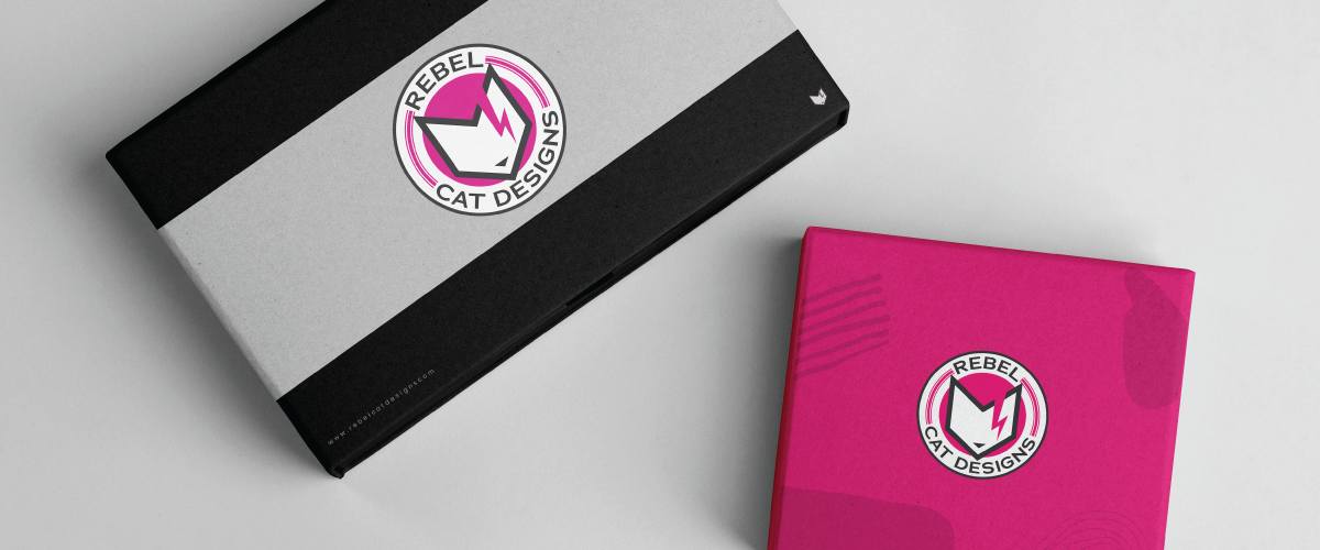
Branding includes everything from ads, packaging, social media styling, and even your website. Basically it's the entire visual element of your business. You want all of these things to compliment your logo. If your main logo font is easily readable you’ll want that to be the main font you use in the rest of your branding. Your logo colors should be used across all of your branding as well.
To keep everything organized and easy to manage across the board, you may want to create a branding guideline. It’s an easy way to help you, and anyone else, stay on brand when creating different materials.
Now what are the main branding materials you should focus on? Let’s go over them below:
Website
Your website, whether it’s on Shopify, Etsy, Wordpress, or whatever platform you sell on, needs to match your branding. How do you do this?
- Font
Use the same font or a font that is similar to your logo (as long as it’s readable). - Logo Colors
For Rebel Cat Designs having too much pink would be overwhelming on the eyes so I’d use the dark gray for most copy and use the pink for things like headers, link hover coloring, and graphical elements like dividers. - Feel
If you have a modern looking logo, your website should have a modern feel. If your logo looks more vintage, give your site a more vintage look.

Social Media/Marketing
These are included in the same section because most of the graphics and designs used would be interchangeable between the two. You want your Instagram and Facebook to have the same look and feel as your business cards and postcards, so why not use the same graphics on all of them? You want customers to immediately associate your Instagram and other social media sites with your brand.
The same rules that were used for creating a matching website are applied to your social media and marketing:
- Font
Except unlike your website where you may need to use a different font for most of it, in this case you’ll definitely want to use your logo’s main font. If it is hard to read, use it for main words and then use an easier to read font for the rest of the copy. - Colors
Continually tie in your logo’s colors on your social media and in marketing. You want your customers to get to the point that when they see your logo’s color anywhere, they automatically associate it with you, even if it’s on something completely unrelated. - Feel
How would you feel if you were to visit their Instagram pages and their feeds were switched? It would be quite a shock right? It may throw you off enough that you may not want to follow them or even buy from them because if their social media isn’t what you expected, would their jewelry be the same?
Packaging
As any jeweler knows, the presentation of your jewelry is extremely important, therefore you want your packaging to be as on brand as your social media and website. While you may not be able to get custom packaging, still find ways to tie in your brand.
Using crinkled paper for your packaging? Match your brand’s colors. Can’t order custom jewelry boxes? Order a stamp of your logo and stamp plain jewelry boxes.
Breaking the Rules
Understanding the basics of brand design will help you not only know how to apply the rules, but when to break them. One of the most common instances where people break their traditional branding guidelines is for holidays and other special occasions.
Another instance is maybe you want to launch a limited edition Earth Day jewelry line as a fundraiser - then you could change your branding to green to help it stand out compared to your other items. Apple does a great job with their (PRODUCT)RED line in which proceeds are donated to HIV/AIDS programs. Even when they only sold products in black, white, and silver, their (PRODUCT)RED products were colored red to help them stand out as a special line.
Wrapping it All Up
As you can see there is a lot of thinking, time, and effort that goes into creating an entire brand identity. Remember, don’t just jump right into designing a brand. You need to understand how exactly your brand needs to be represented first before you even begin sketching out designs.
Make sure any elements you use, like fonts or graphics, are either free to use commercially or are something you have paid for. Keep within your branding guidelines, but don’t be afraid to break your own rules if the circumstances call for it.
Now go forth and create yourself an awesome brand!
Free Resources
For creating your logo:
For creating graphics:
Other great tools:
- Adobe Color - color palette generator
- Google Fonts - free web fonts
- Pexels - stock images
- CreativeBoom - list of free graphic design resources
- Halstead Blog - because of course we’ll always offer you the best business articles to go along with our selection of jewelry articles
The graphic design portion of this blog was written by Janelle Hinesley, former Halstead graphic designer.
Check out these other jewelry marketing tips:
Turn Your Artist Bio Into Your Jewelry Story

